Task 3: Create layout and style
In this task, you will create the layout for the Covid Dashboard App using the shadcn/ui component library. The layout will consist of a header with a select dropdown to choose a country and a statistics section displaying the Covid-19 statistics for the selected country.
Step 1: Install Shadcn UI
The component library we will use is Shadcn/UI. This is not a typical component library; it’s a collection of reusable components that you can copy and paste into your applications. To achieve this goal, we will use the shadcn-cli to install the components. However, you must first configure your project to enable the shadcn-cli to work with it.
Resolve paths
To resolve paths for the Shadcn/UI component library, add the following code to all three tsconfig.app.json, tsconfig.node.json, and tsconfig.json files:
{
"compilerOptions": {
// ...
/* Path aliases */
"baseUrl": ".",
"paths": {
"@/*": ["./src/*"]
}
// ...
}
}Moreover, update vite.config.ts so your app can resolve paths without error:
import path from "path";
import { defineConfig } from "vite";
import react from "@vitejs/plugin-react";
// https://vitejs.dev/config/
export default defineConfig({
base: "",
plugins: [react()],
resolve: {
alias: {
"@": path.resolve(__dirname, "./src"),
},
},
});Since we import the “path” module, we need to install the types for Node.js.
pnpm i -D @types/nodeNow we have properly configured our project to map the @ alias to the src directory.
Use the Shadcn CLI
In this step, we will use the shadcn CLI to create a components.json file that will configure the Shadcn/UI components for our project.
First, open the terminal and run the shadcn init command as shown below:
pnpm dlx shadcn@latest initYou will be asked a few questions to configure components.json:
✔ Preflight checks.
✔ Verifying framework. Found Vite.
✔ Validating Tailwind CSS.
✔ Validating import alias.
✔ Which style would you like to use? › New York
✔ Which color would you like to use as the base color? › Stone
✔ Would you like to use CSS variables for theming? yesAfter answering the questions, you will see the following output:
✔ Writing components.json.
✔ Checking registry.
✔ Updating tailwind.config.js
✔ Updating src/index.css
✔ Installing dependencies.
✔ Created 1 file:
- src/lib/utils.ts
Success! Project initialization completed.
You may now add components.Now the components.json file is created in the root of your project. The file will look like this:
{
"$schema": "https://ui.shadcn.com/schema.json",
"style": "new-york",
"rsc": false,
"tsx": true,
"tailwind": {
"config": "tailwind.config.js",
"css": "src/index.css",
"baseColor": "stone",
"cssVariables": true,
"prefix": ""
},
"aliases": {
"components": "@/components",
"utils": "@/lib/utils",
"ui": "@/components/ui",
"lib": "@/lib",
"hooks": "@/hooks"
}
}Add components
You can now start adding components to your project. This is facilitated by the shadcn-cli. For example, to add a button component, run the following command:
pnpm dlx shadcn@latest add buttonThis will add a button.tsx file to the src/components/ui directory. You can now use this component in your application. Update the src/App.tsx file to use the button component:
import { Button } from "@/components/ui/button";
function App() {
return (
<div className="flex justify-center items-center text-3xl min-h-screen">
<Button>Covid Dashboard</Button>
</div>
);
}
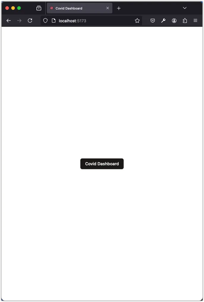
export default App;Now you can run your application (using pnpm dev), navigate to the browser, and you should be able to see the button component in action:
Step 2: Create the layout
In this step, we will create the layout for the Covid Dashboard App. The layout will consist of a header with a select dropdown to choose a country and a statistics section displaying the Covid-19 statistics for the selected country.
We will need the following components for our layout. Run the following commands to add these components:
pnpm dlx shadcn@latest add label
pnpm dlx shadcn@latest add select
pnpm dlx shadcn@latest add card
pnpm dlx shadcn@latest add avatarWe don’t need the button component anymore, so we can remove it:
rm src/components/ui/button.tsxNext, update the src/App.tsx file to create the layout:
import {
Select,
SelectContent,
SelectItem,
SelectTrigger,
SelectValue,
} from "@/components/ui/select";
import { Label } from "@/components/ui/label";
import { Card, CardContent, CardHeader, CardTitle } from "@/components/ui/card";
import { Avatar, AvatarFallback, AvatarImage } from "@/components/ui/avatar";
function App() {
return (
<div className="flex flex-col justify-between items-center min-h-screen max-w-4xl m-auto py-10">
<div className="w-full space-y-12">
<h1 className="text-6xl">Covid Statistics</h1>
<div className="flex flex-col gap-5 justify-start w-full">
<Label className="text-xl">Select a country:</Label>
<Select value="us">
<SelectTrigger className="w-full text-xl p-8 bg-white">
<SelectValue placeholder="Country..." />
</SelectTrigger>
<SelectContent>
<SelectItem value="us">United States</SelectItem>
<SelectItem value="ca">Canada</SelectItem>
</SelectContent>
</Select>
</div>
</div>
<div className="flex w-full justify-between flex-col sm:flex-row gap-5">
<Card className="w-full">
<CardHeader>
<CardTitle>Confirmed</CardTitle>
</CardHeader>
<CardContent className="flex justify-right items-center gap-2">
<Avatar>
<AvatarImage src="https://disease.sh/assets/img/flags/us.png" />
<AvatarFallback>US</AvatarFallback>
</Avatar>
<div className="text-2xl">{(111820082).toLocaleString()}</div>
</CardContent>
</Card>
<Card className="w-full">
<CardHeader>
<CardTitle>Active</CardTitle>
</CardHeader>
<CardContent className="flex justify-right items-center gap-2">
<Avatar>
<AvatarImage src="https://disease.sh/assets/img/flags/us.png" />
<AvatarFallback>US</AvatarFallback>
</Avatar>
<div className="text-2xl">{(786167).toLocaleString()}</div>
</CardContent>
</Card>
<Card className="w-full">
<CardHeader>
<CardTitle>Recovered</CardTitle>
</CardHeader>
<CardContent className="flex justify-right items-center gap-2">
<Avatar>
<AvatarImage src="https://disease.sh/assets/img/flags/us.png" />
<AvatarFallback>US</AvatarFallback>
</Avatar>
<div className="text-2xl">{(109814428).toLocaleString()}</div>
</CardContent>
</Card>
</div>
</div>
);
}
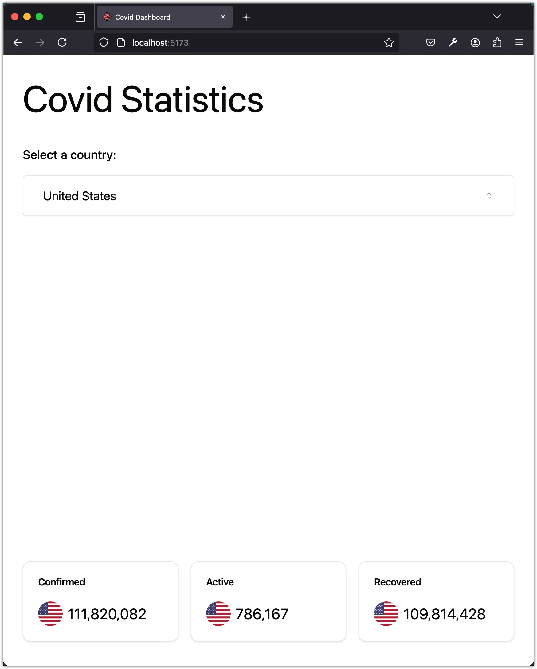
export default App;Now you can run your application (using pnpm dev), navigate to the browser, and you should be able to see the layout for the Covid Dashboard App:
Step 3: Break the layout into components
In this step, we will break the layout into components. We will create two components: SelectCountry and DisplayStatistics.
The SelectCountry component
Create a new file src/components/select-country.tsx:
import {
Select,
SelectContent,
SelectItem,
SelectTrigger,
SelectValue,
} from "@/components/ui/select";
import { Label } from "@/components/ui/label";
const SelectCountry = () => {
return (
<div className="w-full space-y-12">
<h1 className="text-6xl">Covid Statistics</h1>
<div className="flex flex-col gap-5 justify-start w-full">
<Label className="text-xl">Select a country:</Label>
<Select value="us">
<SelectTrigger className="w-full text-xl p-8 bg-white">
<SelectValue placeholder="Country..." />
</SelectTrigger>
<SelectContent>
<SelectItem value="us">United States</SelectItem>
<SelectItem value="ca">Canada</SelectItem>
</SelectContent>
</Select>
</div>
</div>
);
};
export default SelectCountry;The DisplayStatistics component
Create a new file src/components/display-statistics.tsx:
import { Card, CardContent, CardHeader, CardTitle } from "@/components/ui/card";
import { Avatar, AvatarFallback, AvatarImage } from "@/components/ui/avatar";
const DisplayStatistics = () => {
return (
<div className="flex w-full justify-between flex-col sm:flex-row gap-5">
<Card className="w-full">
<CardHeader>
<CardTitle>Confirmed</CardTitle>
</CardHeader>
<CardContent className="flex justify-right items-center gap-2">
<Avatar>
<AvatarImage src="https://disease.sh/assets/img/flags/us.png" />
<AvatarFallback>US</AvatarFallback>
</Avatar>
<div className="text-2xl">{(111820082).toLocaleString()}</div>
</CardContent>
</Card>
<Card className="w-full">
<CardHeader>
<CardTitle>Active</CardTitle>
</CardHeader>
<CardContent className="flex justify-right items-center gap-2">
<Avatar>
<AvatarImage src="https://disease.sh/assets/img/flags/us.png" />
<AvatarFallback>US</AvatarFallback>
</Avatar>
<div className="text-2xl">{(786167).toLocaleString()}</div>
</CardContent>
</Card>
<Card className="w-full">
<CardHeader>
<CardTitle>Recovered</CardTitle>
</CardHeader>
<CardContent className="flex justify-right items-center gap-2">
<Avatar>
<AvatarImage src="https://disease.sh/assets/img/flags/us.png" />
<AvatarFallback>US</AvatarFallback>
</Avatar>
<div className="text-2xl">{(109814428).toLocaleString()}</div>
</CardContent>
</Card>
</div>
);
};
export default DisplayStatistics;Update the App component
Update src/App.tsx to use the new components:
import SelectCountry from "./components/select-country";
import DisplayStatistics from "./components/display-statistics";
function App() {
return (
<div className="flex flex-col justify-between items-center min-h-screen max-w-4xl m-auto py-10">
<SelectCountry />
<DisplayStatistics />
</div>
);
}
export default App;Notice the JSX syntax to import the components. Although components are functions, we use the component name as if it were a tag.
The advantage of breaking the layout into components is that it makes the code more readable and maintainable. Each component is responsible for a specific part of the layout, making it easier to understand and modify.
Thinking in Components
When building a React application, it’s essential to think in components. Components are the building blocks of a React application. They are reusable, independent, and encapsulate the logic and UI of a specific part of the application.
React components are JavaScript functions (or classes) that describe a part of the UI and return HTML (or JSX) to be rendered on a web page. Components can be nested inside other components, allowing you to create complex UIs from simple building blocks. By breaking down the UI into components, we can achieve several benefits:
-
Reusability: Components can be reused across different parts of the application, reducing code duplication and making the codebase more maintainable.
-
Separation of Concerns: Components encapsulate both the UI and the logic related to that UI, making it easier to reason about and maintain the code.
-
Composition: Components can be composed together to create more complex UIs. By combining simple components, you can build more sophisticated interfaces.
-
Isolation: Components are isolated from each other, meaning that changes to one component do not affect other components. This makes it easier to test and debug the application.
By thinking in components, you can break down the UI into smaller, more manageable pieces, making it easier to build and maintain React applications.
Conclusion
In this task, you learned how to create the layout for the Covid Dashboard App using the Shadcn/UI component library. You installed the Shadcn/UI components using the shadcn-cli and created the layout for the app. You then broke the layout into components to make the code more readable and maintainable. By thinking in components, you can build complex UIs from simple building blocks, making it easier to develop and maintain React applications.
In the next task, you will fetch the Covid-19 statistics for the selected country and display them in the app.