Task 3: Enhancing Interface Responsiveness and Visual Appeal
This task focuses on enhancing the visual appeal and responsiveness of the user interface for the “Rock, Paper, Scissors” game. This involves styling the game buttons with Bootstrap, testing responsiveness with developer tools, using breakpoints for layout adjustments, and incorporating a jumbotron for emphasis.
Step 1: Style Buttons with Bootstrap
Let’s style the buttons using Bootstrap’s Button component:
<body>
<div class="container my-5">
<div class="row">
<div class="col">
- <button>Rock</button>
+ <button class="btn btn-primary btn-lg w-100">Rock</button>
</div>
<div class="col">
- <button>Paper</button>
+ <button class="btn btn-primary btn-lg w-100">Paper</button>
</div>
<div class="col">
- <button>Scissors</button>
+ <button class="btn btn-primary btn-lg w-100">Scissors</button>
</div>
</div>
</div>
</body>The classes used to style the button are as follows:
btn: This is the base class for all button types in Bootstrap. It makes the element a button.btn-primary: This adds the primary color (usually blue) to the button.btn-lg: This class makes the button size large.w-100: This class sets the width of the button to 100%, making it span the full width of its parent container.
After saving the page, view it in your browser.
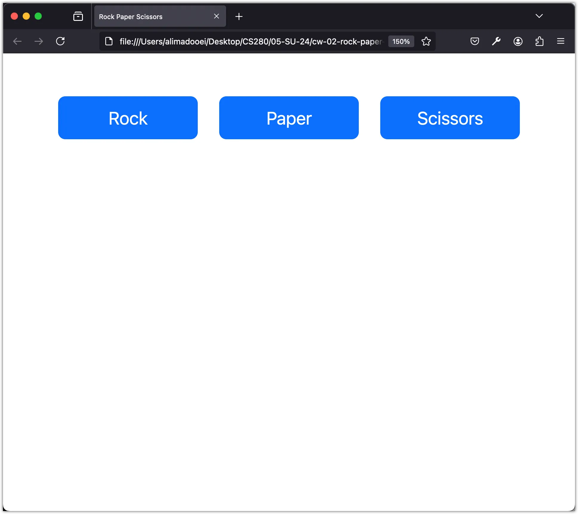
You may have noticed that Bootstrap essentially provides a set of predefined “classes”. You can apply these to any element in your HTML document to style it.
Step 2: Test Responsiveness with Developer Tools
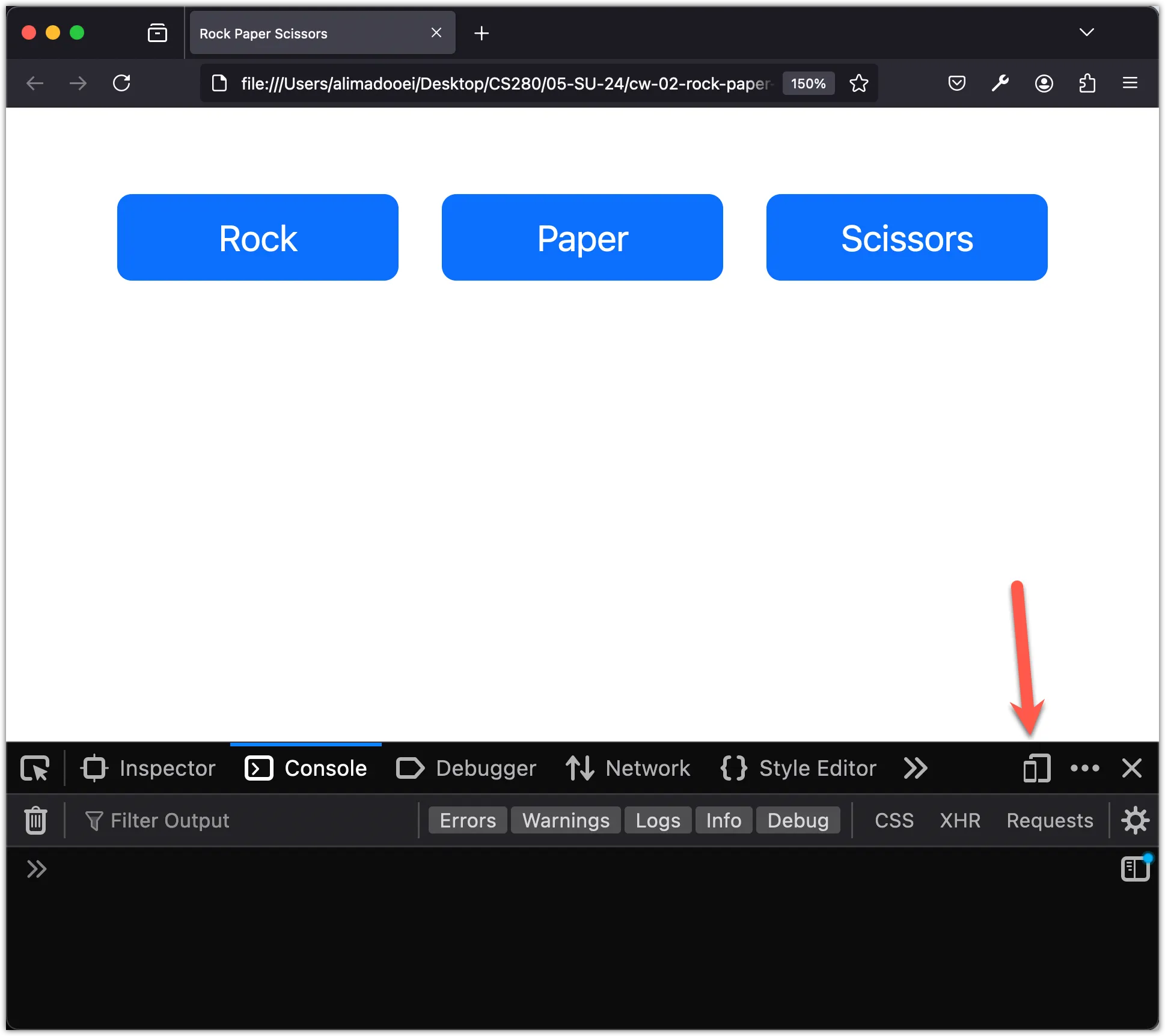
Let’s explore how Bootstrap enhances responsiveness. Start by opening the developer tools, then click the “Responsive Design Mode” in the top right corner of the Developer Tools window.
Next, adjust the screen size! As the screen size changes, you’ll notice that the page margins, button sizes, and spaces between them adjust accordingly. When the screen width shrinks below a certain point, the column layout stacks vertically, ensuring legibility rather than shrinking to illegible sizes.
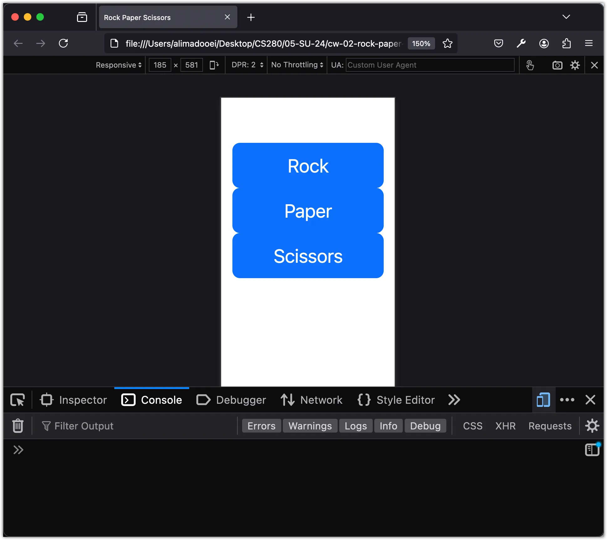
This crucial point is known as a breakpoint. Bootstrap breakpoints are customizable widths that determine your responsive layout’s behavior across different devices.
Step 3: Manage Breakpoints for Layout Adjustments
In the previous step, we covered Bootstrap breakpoints which are defined points where the layout changes. Bootstrap defines these breakpoints as follows:
| Screen Size | Breakpoint | Class modifier |
|---|---|---|
| Extra small | 576px | none |
| Small | 576px | -sm |
| Medium | 768px | -md |
| Large | 992px | -lg |
| Extra large | 1200px | -xl |
| Extra extra large | 1400px | -xxl |
We can utilize these class modifiers to alter our layout at different breakpoints.
For example, when the screen size decreases, there’s a point where the 3-column layout becomes stacked. However, before that point, there’s a stage where the last column stacks under the first two.
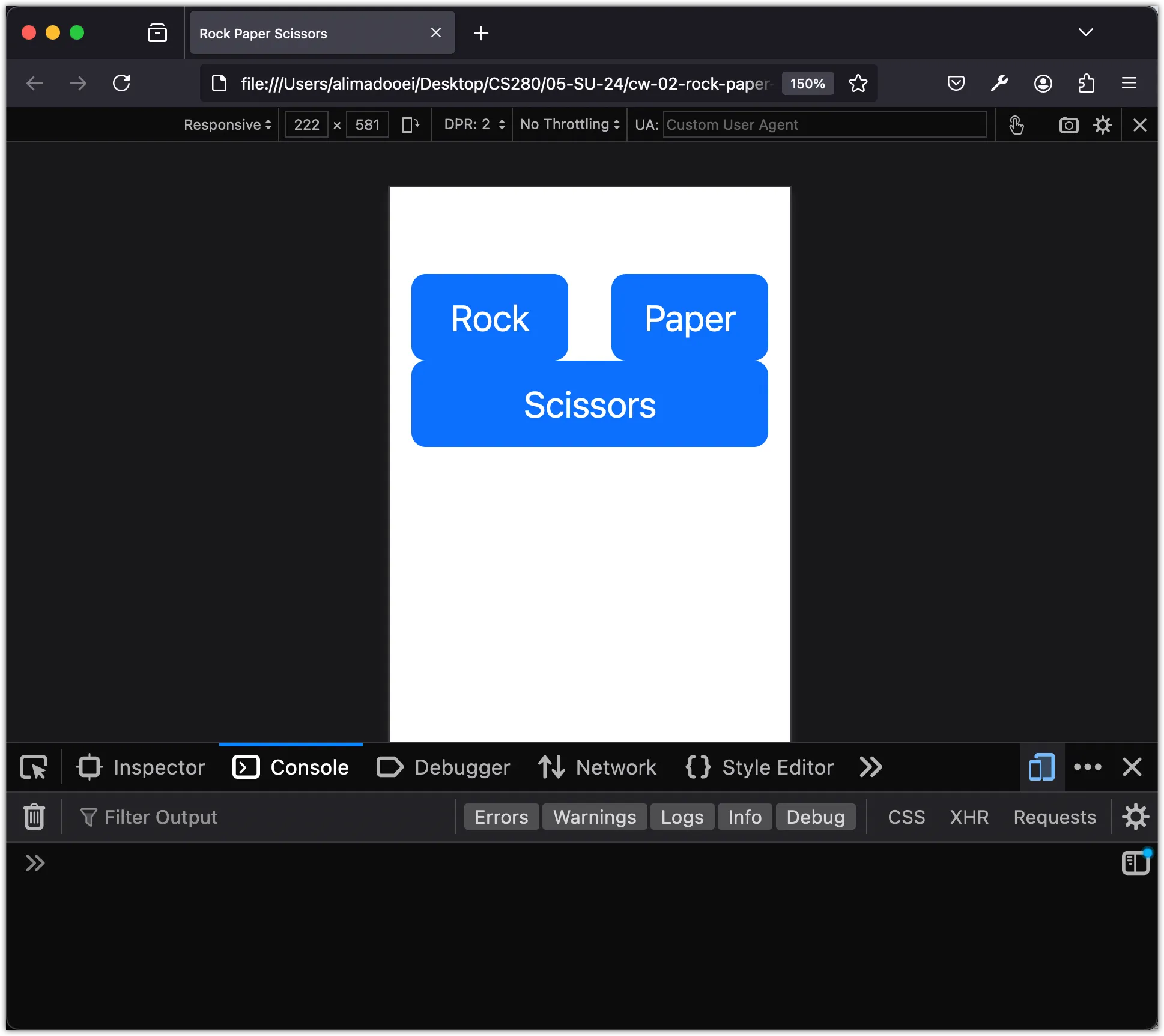
This transition isn’t ideal. It would be better if it goes directly from 3-columns to 3 stacked rows without this intermediate step. Fortunately, this can be fixed. By using a breakpoint class modifier, we can ensure the first two columns stack with the last one:
<body>
<div class="container my-5">
<div class="row">
- <div class="col">
+ <div class="col-sm">
<button class="btn btn-primary btn-lg w-100">Rock</button>
</div>
- <div class="col">
+ <div class="col-sm">
<button class="btn btn-primary btn-lg w-100">Paper</button>
</div>
- <div class="col">
+ <div class="col-sm">
<button class="btn btn-primary btn-lg w-100">Scissors</button>
</div>
</div>
</div>
</body>Adding -sm ensures that when we reach the 575px breakpoint, all three columns expand fully.
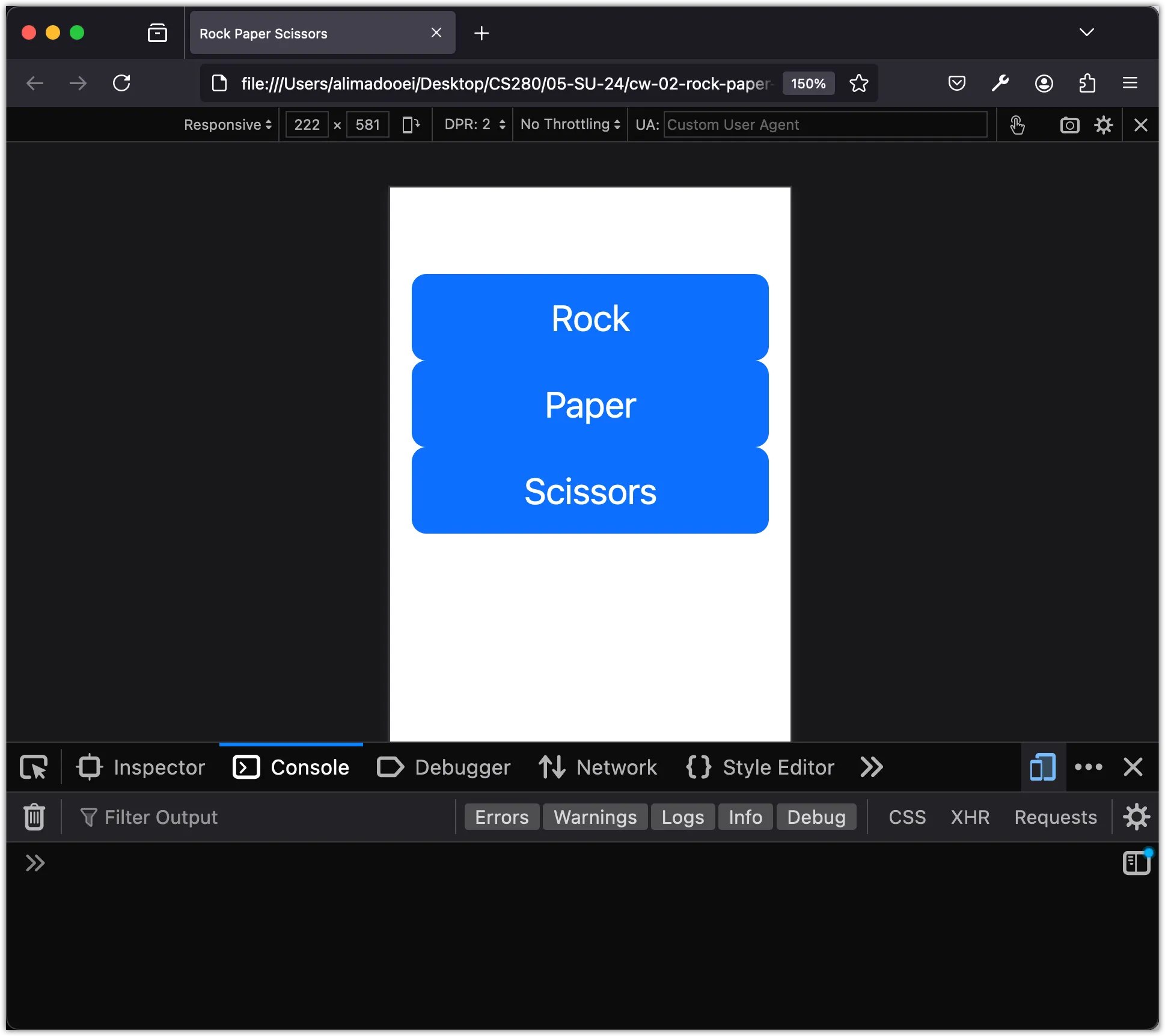
For a final touch, let’s adjust the gap between the columns to make them look better when stacked!
<body>
<div class="container my-5">
- <div class="row">
+ <div class="row gap-2">
<div class="col-sm">
<button class="btn btn-primary btn-lg btn-block">Rock</button>
</div>
<div class="col-sm">
<button class="btn btn-primary btn-lg btn-block">Paper</button>
</div>
<div class="col-sm">
<button class="btn btn-primary btn-lg btn-block">Scissors</button>
</div>
</div>
</div>
</body>The gap-2 class in Bootstrap is used to create a gap or space between columns in a row or between rows in a container. The number 2 signifies the size of the gap. Bootstrap allows you to adjust the gap size by changing this number. In this case, gap-2 creates a moderate space between the elements.
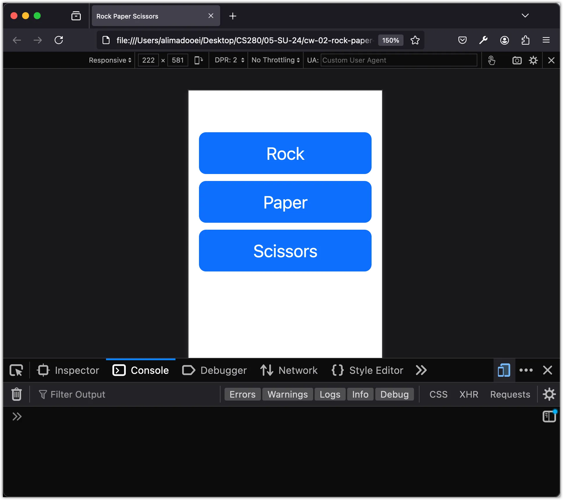
Bootstrap’s grid system is a powerful feature that lets you achieve a lot.
Step 4: Introduce Jumbotron for Emphasis
Next, let’s incorporate a jumbotron (pronounced jum-bo-tron) component into our app!
A jumbotron represents a large grey box used to draw extra attention to specific content or information.
Insert the following code snippet at the beginning of the body element, just beneath the <body> tag:
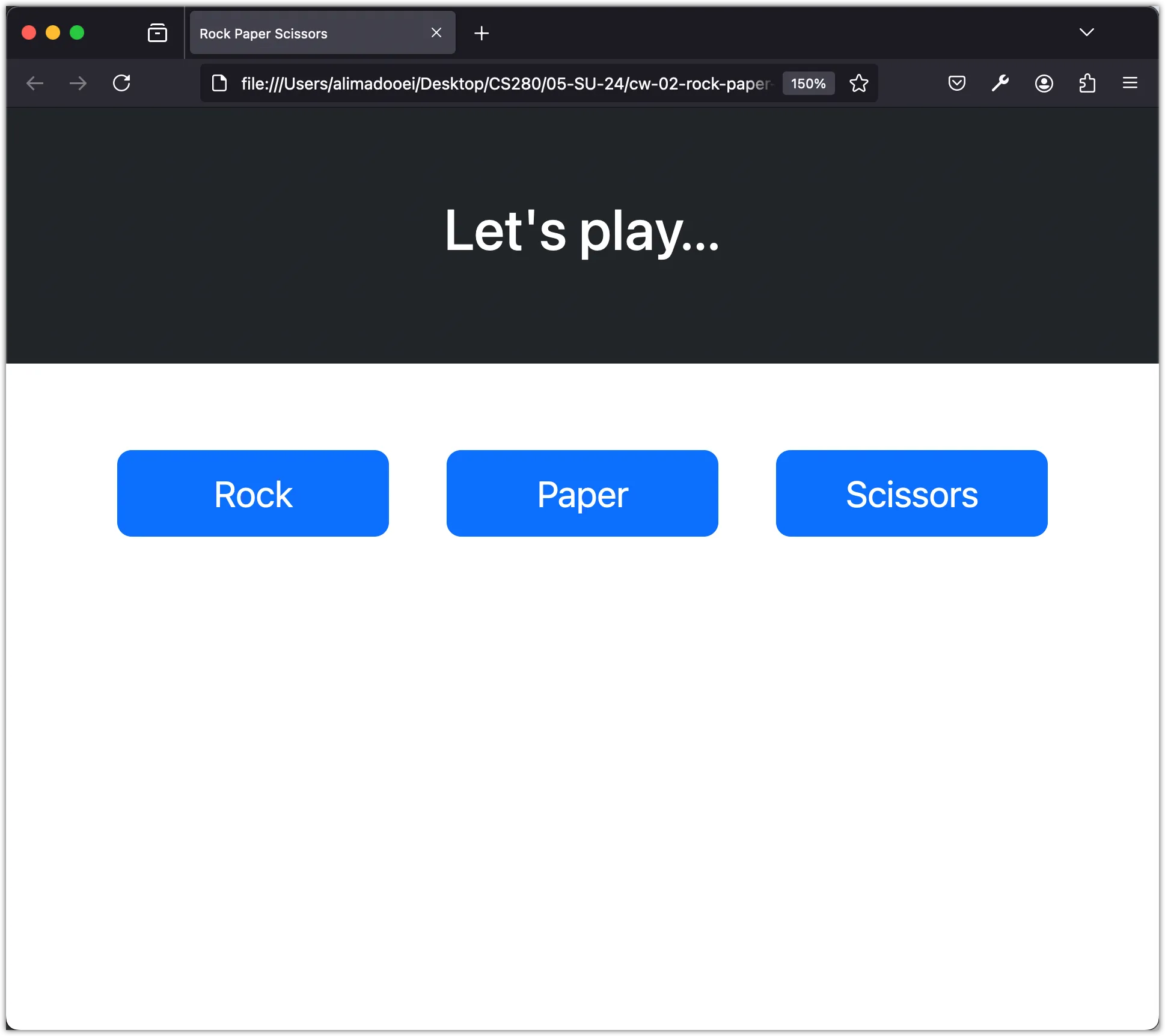
<div class="container-fluid p-5 bg-dark text-white text-center">
<h1>Let's play...</h1>
</div>Here’s the outcome:
