Task 2: Create the App Layout and Main Components
In this task, we will create the main components of the Posts app and set up the app layout.
Step 1: Create the App Layout
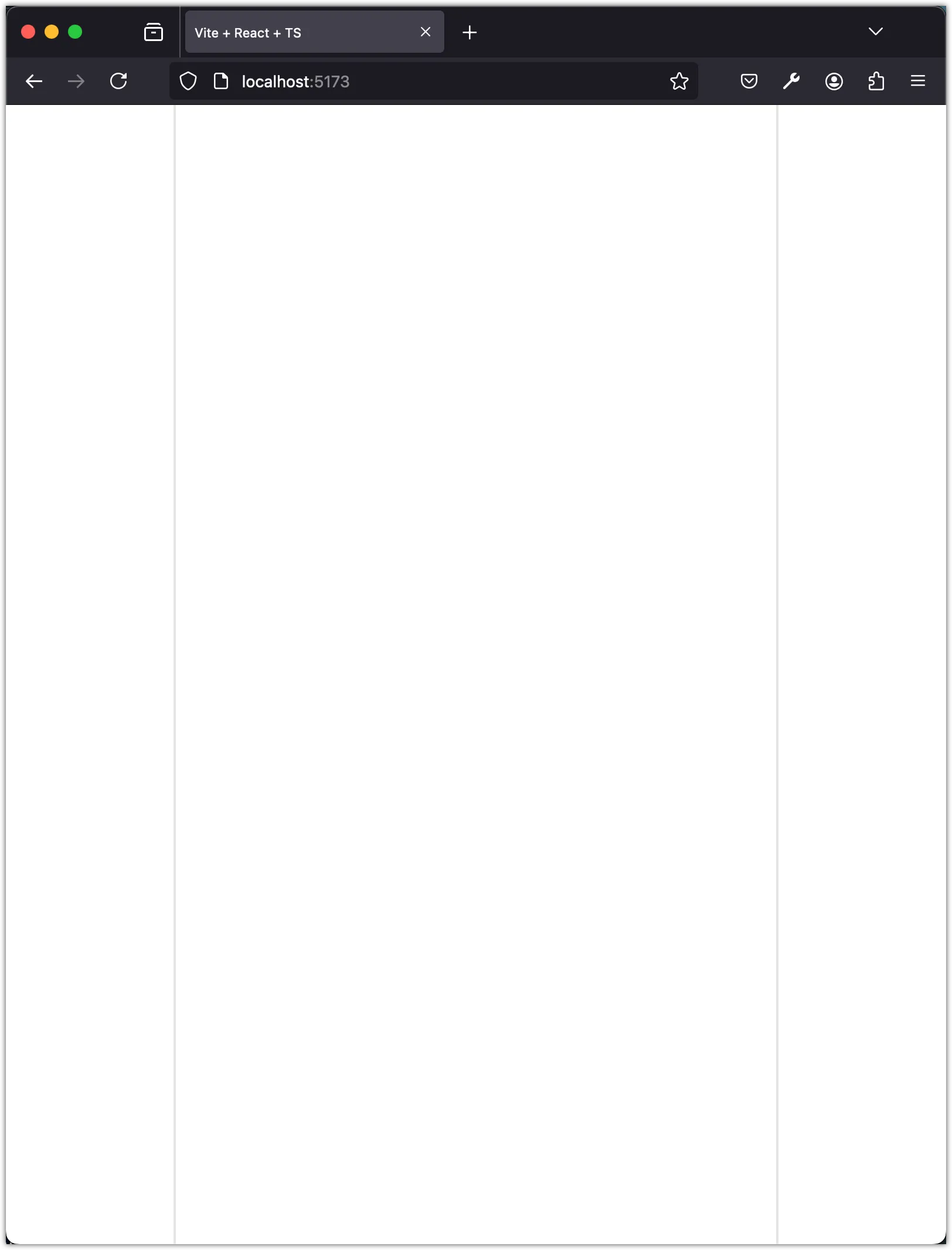
Create the main layout of the app with a sidebar and feed (and a placeholder for another sidebar). We will use the cn utility function to conditionally add classes based on a debug flag. The debug flag will help us visualize the layout during development.
import { cn } from "@/lib/utils";
const DEBUG = true;
function App() {
return (
<div className="flex min-h-dvh">
<div
className={cn("flex-1 min-w-14", {
"border-r-2": DEBUG,
})}
>
{/* Sidebar */}
</div>
<div className="w-full max-w-md mx-auto md:max-w-lg">{/* Feed */}</div>
<div
className={cn("flex-1", {
"border-l-2": DEBUG,
})}
>
{/* Placeholder for another sidebar */}
</div>
</div>
);
}
export default App;Save the file and check the app layout in the browser.
Step 2: Add Sidebar Component
In this step, we will create a sidebar component with three buttons: Home, Search, and Make a Post. We will use the Button component from the @/components/ui/button module and the HomeIcon, MagnifyingGlassIcon, and PlusCircledIcon icons from the @radix-ui/react-icons package. The react-icons package was installed through shadcn-ui during the project setup.
Create a new file named sidebar.tsx in the components folder and add the following code:
import {
HomeIcon,
MagnifyingGlassIcon,
PlusCircledIcon,
} from "@radix-ui/react-icons";
import { Button } from "@/components/ui/button";
const Sidebar = () => {
return (
<div className="flex flex-col items-end p-2 space-y-2">
<Button aria-label={"Home"} variant="ghost" size="icon">
<HomeIcon className="w-5 h-5" />
</Button>
<Button aria-label={"Search"} variant="ghost" size="icon">
<MagnifyingGlassIcon className="w-5 h-5" />
</Button>
<Button aria-label={"Make a Post"} variant="default" size="icon">
<PlusCircledIcon className="w-5 h-5" />
</Button>
</div>
);
};
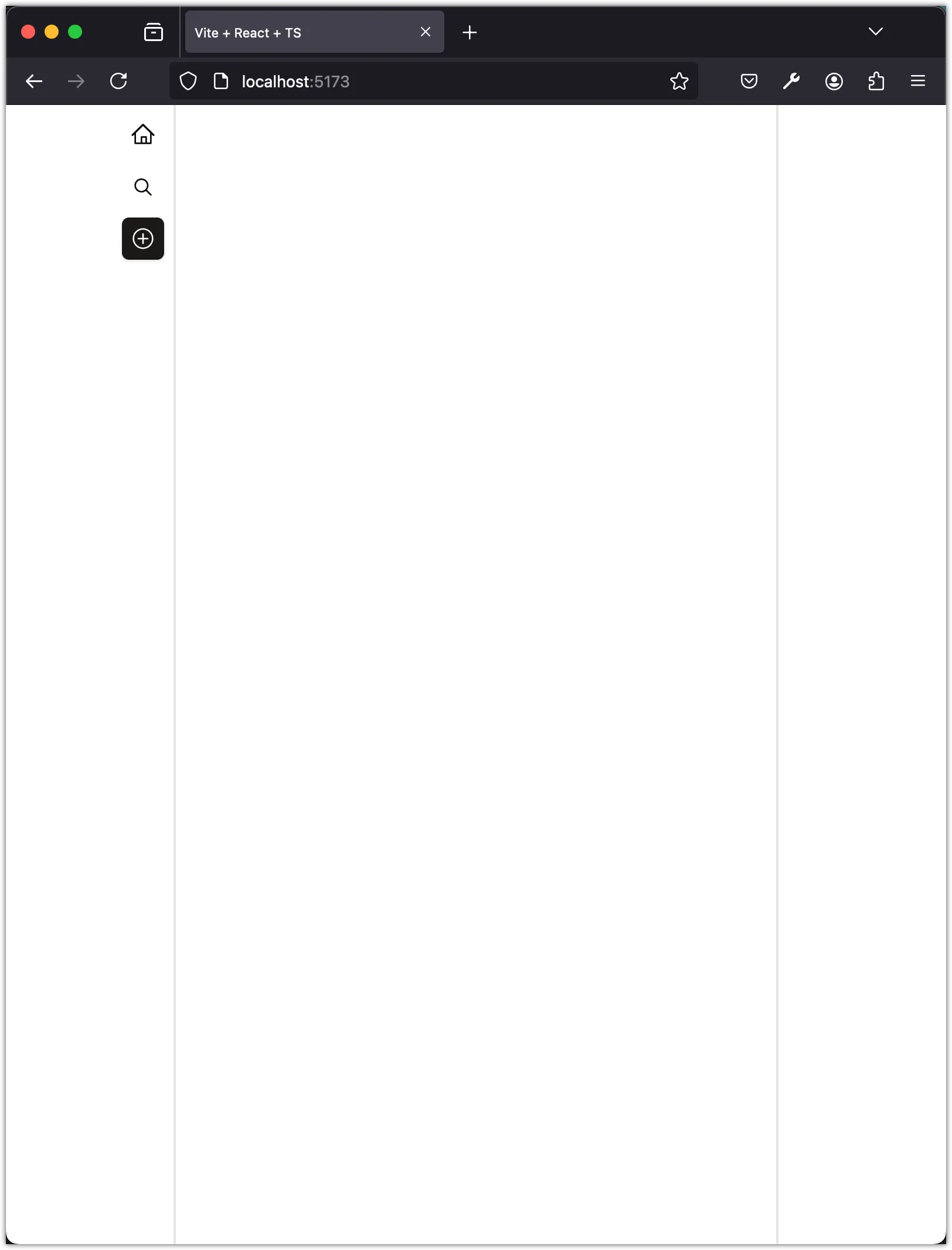
export default Sidebar;Update the App component to include the Sidebar component:
import { cn } from "@/lib/utils";
+ import Sidebar from "@/components/sidebar";
const DEBUG = true;
function App() {
return (
<div className="flex min-h-dvh">
<div
className={cn("flex-1 min-w-14", {
"border-r-2": DEBUG,
})}
>
+ <Sidebar />
</div>
<div className="w-full max-w-md mx-auto md:max-w-lg">{/* Feed */}</div>
<div
className={cn("flex-1", {
"border-l-2": DEBUG,
})}
>
{/* Placeholder for another sidebar */}
</div>
</div>
);
}
export default App;Save the file and check the app layout in the browser.
Step 3: Add Feed Component
Next, we will create a feed component to display posts. We will use the useState hook to manage the posts state and render the posts in a list. The posts will be sorted by date in descending order.
Create a new file named feed.tsx in the components folder and add the following code:
import { Button } from "@/components/ui/button";
import { useState } from "react";
interface PostType {
id: string;
content: string;
date: string;
}
const Feed = () => {
const [posts, setPosts] = useState<PostType[]>([
{
id: "1",
content: "Do only what only you can do.",
date: "2024-06-24T12:00:00Z",
},
{
id: "2",
content:
"Elegance is not a dispensable luxury but a factor that decides between success and failure.",
date: "2024-06-25T12:00:00Z",
},
{
id: "3",
content:
"The question of whether computers can think is like the question of whether submarines can swim.",
date: "2024-06-26T12:00:00Z",
},
]);
return (
<div className="flex flex-col w-full min-h-screen border-x">
<div className="flex justify-center gap-3 p-1 border-b">
<Button variant={"link"}>My Posts</Button>
<Button variant={"link"} disabled={true}>
All Posts
</Button>
</div>
<div>
{posts.
.sort((a, b) => (a.date > b.date ? -1 : 1))
.map((post) => (
<div key={post.id} className="border-b p-4">
{post.content}
</div>
))}
</div>
</div>
);
};
export default Feed;Notice the PostType interface at the top of the file. This interface defines the shape of a post object. The posts contents are quotes from Edsger W. Dijkstra, a Dutch computer scientist known for his contributions to the field of computer science.
Update the App component to include the Feed component:
import { cn } from "@/lib/utils";
import Sidebar from "@/components/sidebar";
+ import Feed from "@/components/feed";
- const DEBUG = true;
+ const DEBUG = false;
function App() {
return (
<div className="flex min-h-dvh">
<div
className={cn("flex-1 min-w-14", {
"border-r-2": DEBUG,
})}
>
<Sidebar />
</div>
<div className="w-full max-w-md mx-auto md:max-w-lg">
+ <Feed />
</div>
<div
className={cn("flex-1", {
"border-l-2": DEBUG,
})}
>
{/* Placeholder for another sidebar */}
</div>
</div>
);
}
export default App;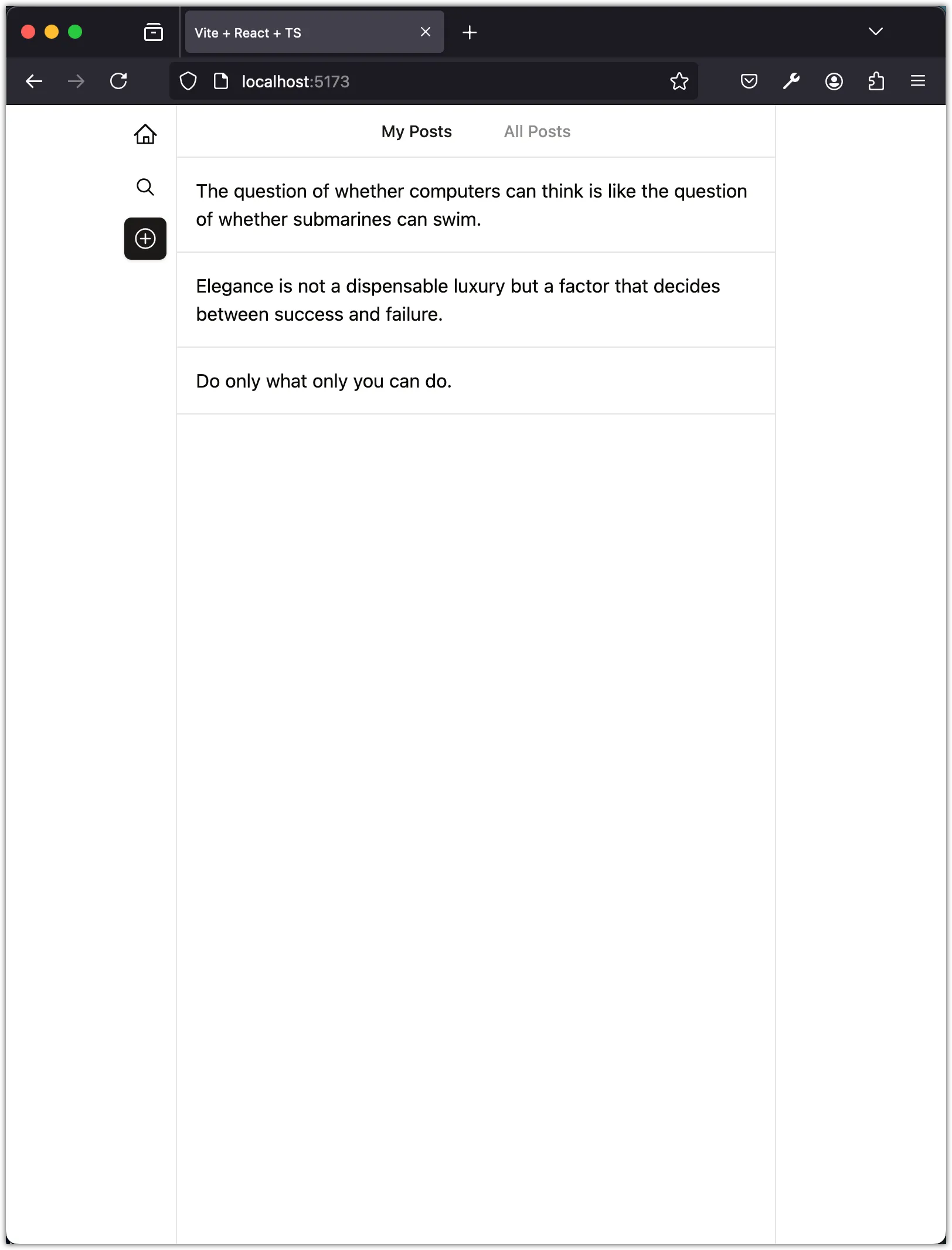
In the next steps, we weill break down the Feed component into smaller components to improve readability and maintainability.
Step 4: Move PostType to data/types.ts
Create a new file named types.ts in the src/data folder and move the PostType interface to this file:
export interface PostType {
id: string;
content: string;
date: string;
}This interface will be used in multiple components, so it’s better to define it in a separate file for reusability.
Step 5: Move Initial Posts to data/db.json
Create a new file named db.json in the src/data folder and move the initial posts data to this file:
{
"posts": [
{
"id": "1",
"content": "Do only what only you can do.",
"date": "2024-06-24T12:00:00Z"
},
{
"id": "2",
"content": "Elegance is not a dispensable luxury but a factor that decides between success and failure.",
"date": "2024-06-25T12:00:00Z"
},
{
"id": "3",
"content": "The question of whether computers can think is like the question of whether submarines can swim.",
"date": "2024-06-26T12:00:00Z"
}
]
}We will use this file to initialize posts data in the Feed component.
Step 6: Add Header Component
Create a new file named header.tsx in the components folder and add the following code:
import { Button } from "@/components/ui/button";
const Header = () => {
return (
<div className="flex justify-center gap-3 p-1 border-b">
<Button variant={"link"}>My Posts</Button>
<Button variant={"link"} disabled={true}>
All Posts
</Button>
</div>
);
};
export default Header;Notice that we are using the Button component and style it as a link. The disabled attribute is set to true for the “All Posts” button to indicate that it is not clickable. In this tutorial, we focus on CRUD operations for “My Posts” only.
Step 7: Add Posts Component
Create a new file named posts.tsx in the components folder and add the following code:
import { useState } from "react";
import { PostType } from "@/data/types";
import db from "@/data/db.json";
const Posts = () => {
const [posts, setPosts] = useState<PostType[]>(db.posts);
return (
<div>
{posts.
.sort((a, b) => (a.date > b.date ? -1 : 1))
.map((post) => (
<div key={post.id} className="border-b p-4">
{post.content}
</div>
))}
</div>
);
};
export default Posts;Notice that we are using the PostType interface and the initial posts data from the db.json file. In particular, pay attention to how we can import JSON files in Vite without any additional configuration.
With this component, we have separated the rendering of individual posts into a separate component. This separation of concerns makes the code more modular and easier to maintain.
Step 8: Update Feed Component
Now, we will update the Feed component to include the Header and Posts components:
import Header from "./header";
import Posts from "./posts";
const Feed = () => {
return (
<div className="flex flex-col w-full min-h-screen border-x">
<Header />
<Posts />
</div>
);
};
export default Feed;This separation of components makes the code more readable and maintainable. The Header component is responsible for rendering the header buttons, while the Posts component is responsible for rendering the list of posts.
Step 9: Add Post Component
Let’s refine how each post is displayed by creating a new post.tsx component:
import { PostType } from "@/data/types";
import { Button } from "@/components/ui/button";
import { TrashIcon, Pencil2Icon } from "@radix-ui/react-icons";
const Post = ({ post }: { post: PostType }) => {
return (
<div className="p-1 border-b">
<div className="flex items-center justify-between pl-4">
<div className="text-xs text-muted-foreground">
{new Date(post.date).toLocaleString("en-US", {
month: "short",
day: "numeric",
year: "numeric",
hour: "numeric",
minute: "numeric",
})}
</div>
<div className="flex justify-end">
<Button variant={"ghost"} size={"icon"}>
<Pencil2Icon className="w-4 h-4" />
</Button>
<Button variant={"ghost"} size={"icon"}>
<TrashIcon className="w-4 h-4" />
</Button>
</div>
</div>
<p className="p-4">{post.content}</p>
</div>
);
};
export default Post;In this component, we display the post content, date, and icons for editing and deleting the post. Now, update the Posts component to use the Post component:
import { useState } from "react";
import { PostType } from "@/data/types";
import db from "@/data/db.json";
+ import Post from "./post";
const Posts = () => {
const [posts, setPosts] = useState<PostType[]>(db.posts);
return (
<div>
{posts.
.sort((a, b) => (a.date > b.date ? -1 : 1))
.map((post) => (
- <div key={post.id} className="border-b p-4">
- {post.content}
- </div>
+ <Post key={post.id} post={post} />
))}
</div>
);
};
export default Posts;Save the files and check the app layout in the browser.
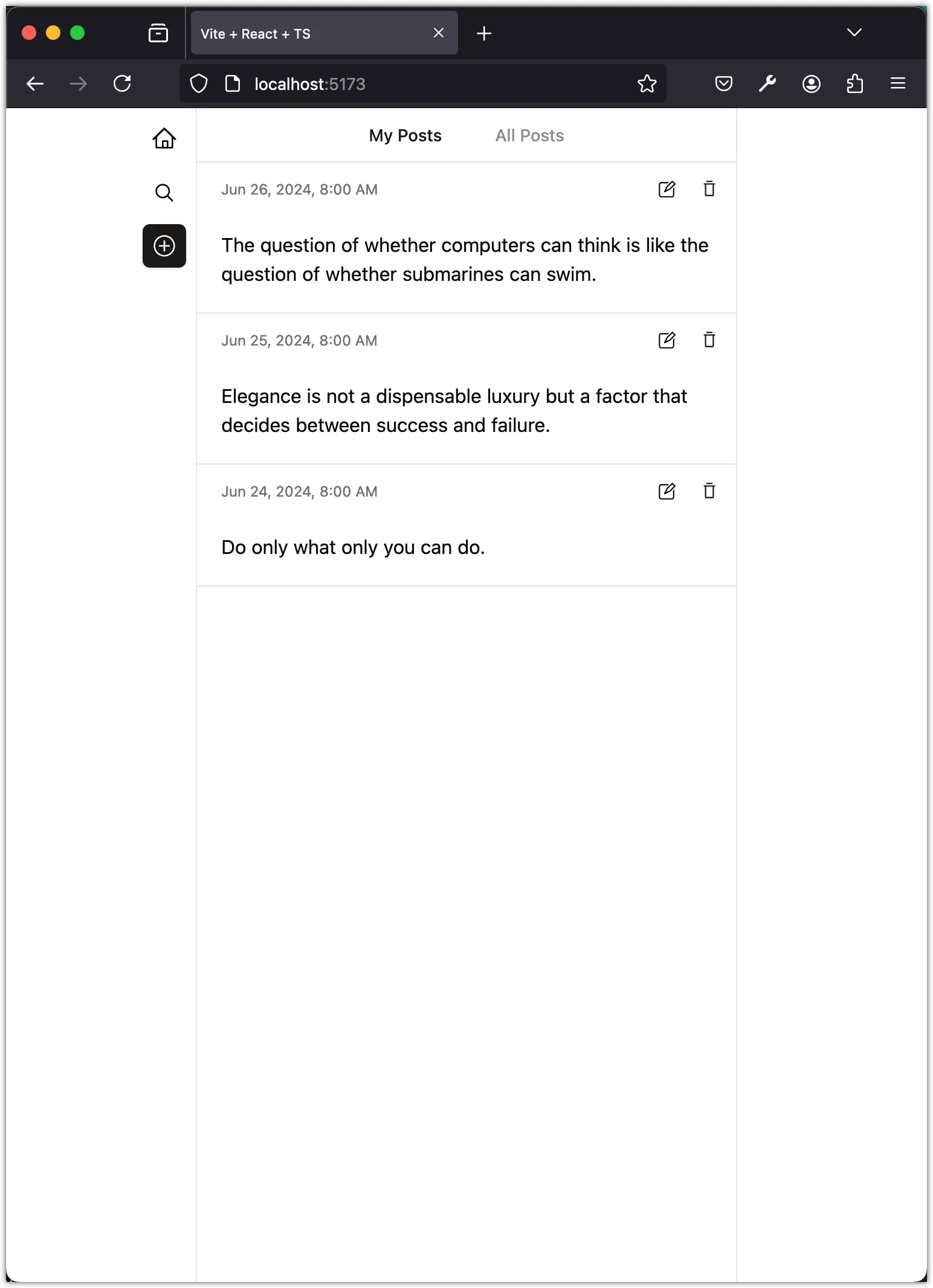
Step 10: Add PostActions Component
We can further refactor the Post component by extracting the post actions (edit and delete buttons) into a separate component. Create a new file named post-actions.tsx in the components folder and add the following code:
import { Button } from "@/components/ui/button";
import { TrashIcon, Pencil2Icon } from "@radix-ui/react-icons";
const PostActions = () => {
return (
<div className="flex justify-end">
<Button variant={"ghost"} size={"icon"}>
<Pencil2Icon className="w-4 h-4" />
</Button>
<Button variant={"ghost"} size={"icon"}>
<TrashIcon className="w-4 h-4" />
</Button>
</div>
);
};
export default PostActions;Now, update the Post component to use the PostActions component:
import { PostType } from "@/data/types";
- import { Button } from "@/components/ui/button";
- import { TrashIcon, Pencil2Icon } from "@radix-ui/react-icons";
+ import PostActions from "./post-actions";
const Post = ({ post }: { post: PostType }) => {
return (
<div className="p-1 border-b">
<div className="flex items-center justify-between pl-4">
<div className="text-xs text-muted-foreground">
{new Date(post.date).toLocaleString("en-US", {
month: "short",
day: "numeric",
year: "numeric",
hour: "numeric",
minute: "numeric",
})}
</div>
- <div className="flex justify-end">
- <Button variant={"ghost"} size={"icon"}>
- <Pencil2Icon className="w-4 h-4" />
- </Button>
- <Button variant={"ghost"} size={"icon"}>
- <TrashIcon className="w-4 h-4" />
- </Button>
- </div>
+ <PostActions />
</div>
<p className="p-4">{post.content}</p>
</div>
);
};
export default Post;Save the files and check the app layout in the browser to make sure everything is working as expected.
Conclusion
In this task, we created the main components of the Posts app and set up the app layout. We created the Sidebar, Feed, Header, Posts, Post, and PostActions components. We also moved the PostType interface to a separate file and the initial posts data to a JSON file. This separation of concerns makes the code more modular and easier to maintain. In the next task, we will add functionality to create, read, update, and delete posts.